Introduction to Seaborn & Data Loading
Hey, it’s Anand here. Let’s talk about Seaborn. If Matplotlib is the basic paintbrush every chart in Python is built on, Seaborn is the upgraded kit that already knows how to make things look clean, handle statistics properly, and work directly with your data tables. It’s built right on top of Matplotlib, so anything you learn here still plays nice with it.
Seaborn is built directly on top of Matplotlib and integrates tightly with pandas DataFrames. It takes care of fiddly styling, statistical aggregation, grouping, and legends automatically.
What Even Is Seaborn?
The Simple Explanation
Seaborn is a free, open-source Python library for making statistical graphics. These aren’t just bare charts—they help you uncover patterns, distributions, relationships, and variance across complex datasets with minimal boilerplate code.
Why Not Just Use Matplotlib Alone?
Matplotlib gives you total, pixel-level control, but you have to build everything by hand: picking palettes, grouping categories, calculating statistical summaries, and placing legends. Seaborn streamlines all of that:
Seaborn Advantages
- DataFrame-first: Accepts column names directly via
data=df, x='col_x', y='col_y'. - Smart defaults: Attractive color schemes, gridlines, and typography out of the box.
- Built-in statistics: Automatically computes confidence intervals, regressions, medians, and density estimates.
- Multi-plot layouts: Create small-multiple facet grids with a single function call.
Popular Chart Types in Seaborn
| Chart Type | Function | Primary Purpose |
|---|---|---|
| Scatter Plot | sns.scatterplot() | Relationship between two numeric variables |
| Line Plot | sns.lineplot() | Continuous trends over time or sequence |
| Bar Plot | sns.barplot() | Comparing aggregate values across categories |
| Histogram | sns.histplot() | Frequency and distribution spread of values |
| Box Plot | sns.boxplot() | Median, quartiles, spread, and outlier detection |
| Violin Plot | sns.violinplot() | Density shape combined with box plot metrics |
| Heatmap | sns.heatmap() | 2D matrix values and correlation matrices |
| Pair Plot | sns.pairplot() | Pairwise bivariate distributions across all features |
Installing & Verifying Seaborn
Install Seaborn using pip:
pip install seabornLet’s check that Seaborn is installed and inspect its version:
Example
Output:
Getting Set Up and Loading Data
The Standard Import Convention
Just like pandas becomes pd and numpy becomes np, Seaborn is almost always imported as sns:
import seaborn as sns
import matplotlib.pyplot as pltWhy do you still need Matplotlib?
Seaborn draws on Matplotlib axes objects. You’ll frequently call plt.title(), plt.xlabel(), plt.tight_layout(), and plt.show() alongside Seaborn commands.
Built-in Practice Datasets
Seaborn includes ready-made practice datasets so you can experiment without needing external CSV files:
Example
Output:
Your First Seaborn Plot: Distribution of Bills
Let’s draw a quick histogram using sns.histplot():
import seaborn as sns
import matplotlib.pyplot as plt

tips = sns.load_dataset('tips')
sns.histplot(tips['total_bill'])
plt.show()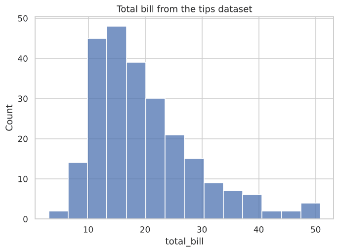
Figure 1.1: What the first histogram looks like.
Try It Yourself
Problem 1: Check Seaborn Version
Import seaborn and print its installed version.
PygroundTry It Out
Import seaborn and print its version.
Output:
Problem 2: Load the Iris Dataset
Load the built-in iris dataset using sns.load_dataset('iris') and display its first 5 rows.