Categorical Plots: Bar, Box, Violin, Strip & Swarm
Categorical plots are designed for comparing numeric metrics across distinct groups or categories. Seaborn offers five complementary tools that range from summary averages to full point-level scatter.
1. Bar Plots & Count Plots
barplot: Aggregated Group Means
Unlike simple bar counters, Seaborn’s barplot() computes the mean for each category by default and displays a small black error bar indicating estimation uncertainty:
import seaborn as sns
import matplotlib.pyplot as plt

tips = sns.load_dataset('tips')
sns.barplot(data=tips, x='day', y='total_bill', hue='sex')
plt.show()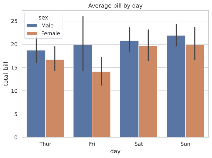
Figure 4.1: Bars indicate the average bill, and vertical lines denote error intervals.
countplot: Counting Frequencies
When you only want to know how many rows fall into each category without computing an average, use countplot():
import seaborn as sns
import matplotlib.pyplot as plt

tips = sns.load_dataset('tips')
sns.countplot(data=tips, x='day')
plt.show()
2. Box Plots: The Five-Number Summary
A box plot summarizes numbers using 5 key reference values:
Reading a Box Plot
- Median Line: Center mark representing the 50th percentile.
- Box Body (IQR): Spans the 25th (Q1) to 75th (Q3) percentile—covering the middle 50% of the data.
- Whiskers: Extend to 1.5 × IQR to denote expected variation.
import seaborn as sns
import matplotlib.pyplot as plt

tips = sns.load_dataset('tips')
sns.boxplot(data=tips, x='day', y='total_bill', hue='smoker')
plt.show()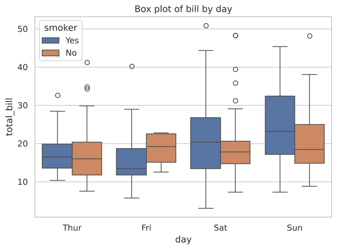
Figure 4.2: Box plots showing medians, interquartile ranges, and outlier points.
3. Violin Plots: KDE Meets Box Plots
Violin plots combine the box plot’s summary markers with a smoothed KDE curve. Wider regions show where data points cluster most densely:
import seaborn as sns
import matplotlib.pyplot as plt

tips = sns.load_dataset('tips')
sns.violinplot(data=tips, x='day', y='total_bill', hue='smoker', split=True)
plt.show()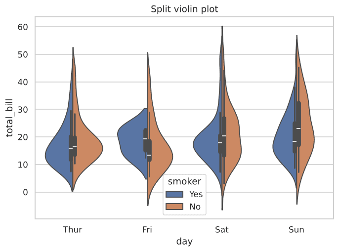
Figure 4.3: Split violins show both groups side-by-side inside the same body.
4. Strip & Swarm Plots: Every Point Visible
Bar and box plots aggregate data, hiding individual outliers or multimodality. Strip and swarm plots show every single observation:
Strip Plot (Jitter)
Adds a small amount of random horizontal jitter to reduce point overlap:
sns.stripplot(data=tips, x='day', y='total_bill')import seaborn as sns
import matplotlib.pyplot as plt
tips = sns.load_dataset('tips')
sns.swarmplot(data=tips, x='day', y='total_bill')
plt.show()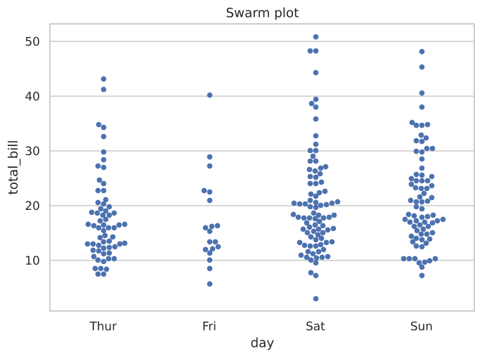
Figure 4.4: Every single observation spread out cleanly without overlapping.
Interactive Group Comparison
Inspect category distributions programmatically:
Example
Output:
Try It Yourself
Problem 1: Bar Plot with Splitting
Make a bar plot showing average tip by day, split by smoker.
PygroundTry It Out
Make a bar plot showing average tip by day, split by smoker.
Output:
Problem 2: Box Plot by Meal Time
Make a box plot of total_bill by time (Lunch vs Dinner).
PygroundTry It Out
Make a box plot of total_bill by time.
Output:
Problem 3: Swarm Plot of Tips
Make a swarm plot of tip by day.