Regression Plots: Fitting Statistical Trends
Regression plots in Seaborn don’t just display raw scatter points—they calculate and draw a best-fit linear regression line accompanied by a 95% bootstrap confidence interval.
1. Linear Regression with regplot
sns.regplot() accepts x and y coordinates or DataFrame columns, fits a linear regression model, and draws the trend line:
import seaborn as sns
import matplotlib.pyplot as plt

tips = sns.load_dataset('tips')
sns.regplot(data=tips, x='total_bill', y='tip')
plt.show()The shaded band surrounding the line illustrates the confidence interval. Where points are concentrated and predictable, the band is narrow; where points scatter widely, the interval expands.
2. Multi-Facet Regressions with lmplot
While regplot() is an axes-level function, lmplot() is a figure-level function that combines regplot() with FacetGrid. It allows you to fit separate regression models across groups using hue, col, or row:
import seaborn as sns
import matplotlib.pyplot as plt

tips = sns.load_dataset('tips')
sns.lmplot(data=tips, x='total_bill', y='tip', hue='smoker')
plt.show()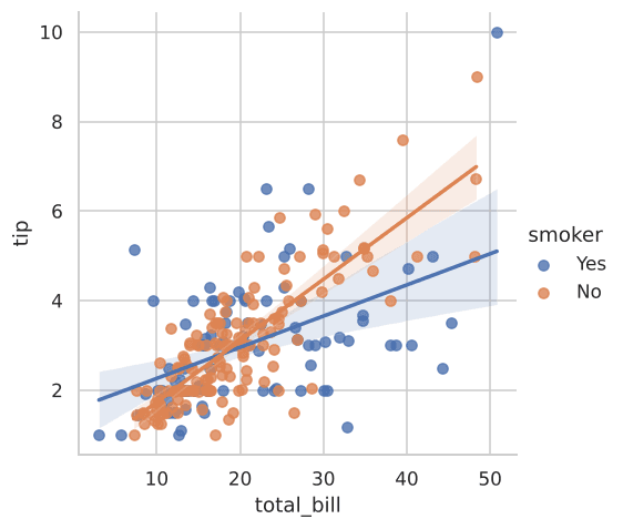
Figure 6.1: Distinct linear regression lines and confidence bands for smokers vs non-smokers.
Comparing regplot and lmplot
| Feature | sns.regplot | sns.lmplot |
|---|---|---|
| Level | Axes-level (embeds in existing subplots) | Figure-level (manages its own figure grid) |
hue Support | Limited styling | Splits data and fits distinct regression models |
| Faceted Subplots | Manual via Matplotlib plt.subplots() | Native via col='...' and row='...' |
Interactive Regression Exploration
Examine regression parameters and trend values:
Example
Output:
Try It Yourself
Problem 1: Regression Split by Meal Time
Using tips, create an lmplot of total_bill vs tip with separate regression lines for time (Lunch vs Dinner).