Multi-Plot Grids & Dashboards
While FacetGrid generates small multiples of the same chart across categories, practical dashboards often require different plot types side by side in a single multi-panel figure.
1. Embedding Seaborn into Matplotlib Subplots
Because Seaborn renders onto Matplotlib axes, every axes-level function accepts an ax parameter.
1 Row × 2 Columns Layout
import seaborn as sns
import matplotlib.pyplot as plt

tips = sns.load_dataset('tips')

fig, axes = plt.subplots(1, 2, figsize=(10, 4))

sns.histplot(data=tips, x='total_bill', ax=axes[0])
sns.boxplot(data=tips, x='day', y='total_bill', ax=axes[1])

plt.tight_layout()
plt.show()
2. A 2 × 2 Analytical Dashboard
Combine histograms, box plots, scatter plots, and bar plots into a comprehensive overview:
import seaborn as sns
import matplotlib.pyplot as plt

tips = sns.load_dataset('tips')

fig, axes = plt.subplots(2, 2, figsize=(10, 8))

# Top-Left: Distribution
sns.histplot(data=tips, x='total_bill', ax=axes[0, 0])
axes[0, 0].set_title('Bill Distribution')

# Top-Right: Variance by Day
sns.boxplot(data=tips, x='day', y='total_bill', ax=axes[0, 1])
axes[0, 1].set_title('Spending by Day')

# Bottom-Left: Relationship
sns.scatterplot(data=tips, x='total_bill', y='tip', ax=axes[1, 0])
axes[1, 0].set_title('Bill vs Tip')

# Bottom-Right: Categorical Aggregation
sns.barplot(data=tips, x='day', y='tip', ax=axes[1, 1])
axes[1, 1].set_title('Average Tip by Day')

plt.tight_layout()
plt.show()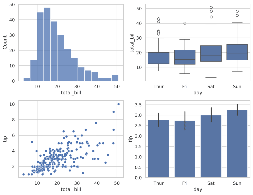
Figure 8.1: A 2×2 dashboard displaying four distinct chart types in a unified figure.
Always remember to call plt.tight_layout() before plt.show() or plt.savefig(). This automatically adjusts spacing between subplot axes to prevent overlapping labels and titles.
Interactive Grid Dimension Calculation
Experiment with subplots dimensions programmatically:
Example
Output:
Try It Yourself
Problem: 1 Row, 2 Columns Dashboard
Build a 1 row, 2 column layout showing a KDE plot of tip on the left (axes[0]) and a violin plot of total_bill by day on the right (axes[1]).