Styling, Themes, Palettes & Presentation
Seaborn features an aesthetic engine designed to make figures legible and publication-ready with minimal adjustment. You can customize the look globally or on a per-plot basis.
1. Setting Themes & Styles
Seaborn includes five primary background styles: darkgrid (default), whitegrid, dark, white, and ticks.
import seaborn as sns
import matplotlib.pyplot as plt

# Switch global styling
sns.set_theme(style='darkgrid')

tips = sns.load_dataset('tips')
sns.histplot(data=tips, x='total_bill')
plt.show()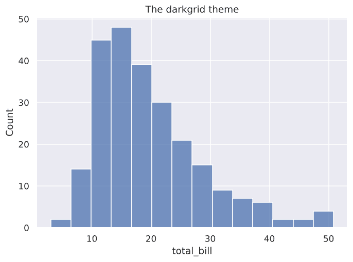
Figure 7.1: Clean background grid and tick styles applied with one line.
Scaling Context for Presentations
Adjust font sizes, line widths, and marker scales for different media using context:
'paper': Compact (default for articles).'notebook': Medium (default in Jupyter).'talk': Larger font and line sizes for lectures and slide decks.'poster': Extra-large elements for exhibition boards.
sns.set_theme(context='talk', style='whitegrid')2. Choosing the Right Color Palette
Color palettes convey essential meaning. Choosing an inappropriate palette can distort how data is perceived:
Qualitative
Qualitative Palettes ('deep', 'muted', 'pastel', 'bright', 'dark', 'colorblind'):
Best for distinct categories with no natural ordering (e.g. Days of the week, gender, meal time).
sns.barplot(data=tips, x='day', y='total_bill', palette='pastel')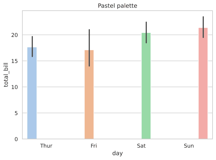
Figure 7.2: Qualitative pastel palette applied across categorical bars.
3. Presentation-Ready Polish: Labels, Legends & Saving
Seaborn automatically infers axis labels from DataFrame columns, but final presentations require polished formatting:
import seaborn as sns
import matplotlib.pyplot as plt

tips = sns.load_dataset('tips')

sns.scatterplot(data=tips, x='total_bill', y='tip', hue='time')
plt.title('Tip Amount vs Total Bill', fontsize=14, weight='bold')
plt.xlabel('Total Bill ($)', fontsize=12)
plt.ylabel('Tip ($)', fontsize=12)
plt.legend(title='Meal Time', loc='upper left')

# Export high-resolution image
plt.savefig('polished_chart.png', dpi=300, bbox_inches='tight')
plt.show()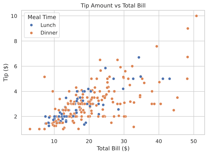
Figure 7.3: Presentation-ready plot with clear title, unit labels, and formatted legend.
Interactive Palette Preview
List available qualitative color names programmatically:
Example
Output:
Try It Yourself
Problem 1: Custom Theme & Palette
Set the theme to 'whitegrid', load tips, and create a histogram of tip using histplot.
PygroundTry It Out
Switch to the whitegrid theme and plot a histogram of tip.
Output:
Problem 2: Labeled & Saved Bar Chart
Create a bar plot of average tip by day, give it the title "Average Tip by Day", label the x-axis "Day of the Week", label the y-axis "Average Tip ($)", and save it to tip_by_day.png.