Matrix & Multi-Plot Grids
When analyzing datasets with many variables, a single plot is rarely sufficient. Seaborn provides matrix visualizations and automated multi-panel grid tools to survey entire tables efficiently.
1. Heatmaps & Correlation Matrices
Understanding Correlation
Correlation measures the linear relationship between two variables on a scale from -1.0 to +1.0:
- +1.0: Strong positive linear relationship (both increase together).
- -1.0: Strong negative linear relationship (one increases as the other decreases).
- 0.0: No linear relationship.
A heatmap maps numbers into color cells, turning an overwhelming table of values into an easily scannable visual grid:
import seaborn as sns
import matplotlib.pyplot as plt

tips = sns.load_dataset('tips')
correlation = tips.corr(numeric_only=True)
sns.heatmap(correlation, annot=True, cmap='coolwarm', center=0)
plt.show()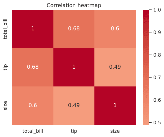
Figure 5.1: Heatmap of tips correlation matrix with numerical annotations.
2. Pair Plots: Everything Against Everything
sns.pairplot() plots every numeric column against every other numeric column in a square matrix. The diagonal renders a univariate histogram or KDE curve for each variable:
import seaborn as sns
import matplotlib.pyplot as plt

iris = sns.load_dataset('iris')
sns.pairplot(iris, hue='species')
plt.show()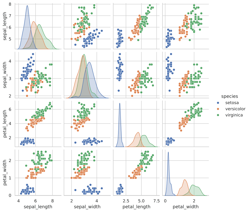
Figure 5.2: Pair plot of all Iris features colored by flower species.
3. Joint Plots: Bivariate Scatter + Marginal Distributions
A joint plot combines a central bivariate plot (scatter, KDE, or hexbin) with marginal univariate histograms along the outer axes:
Scatter Style
sns.jointplot(data=tips, x='total_bill', y='tip')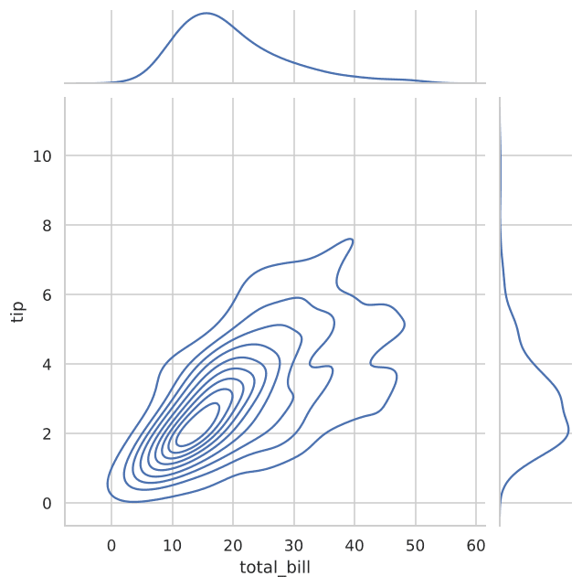
Figure 5.3: Joint plot showing density contours in the center and distributions along the edges.
4. Facet Grids: Subplots for Every Category Combination
FacetGrid splits your dataset across categorical rows and columns, mapping a designated plotting function across each panel:
import seaborn as sns
import matplotlib.pyplot as plt

tips = sns.load_dataset('tips')
g = sns.FacetGrid(tips, col='time', row='smoker')
g.map(sns.scatterplot, 'total_bill', 'tip')
plt.show()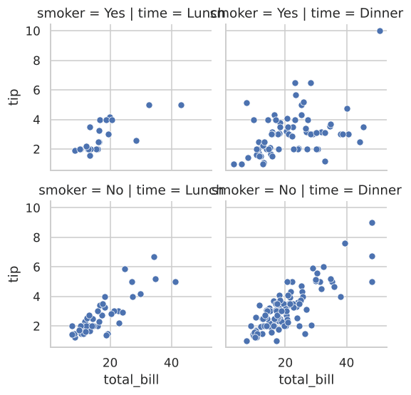
Figure 5.4: One small scatter plot for each category combination.
Interactive Correlation Check
Compute and inspect matrix correlations dynamically:
Example
Output:
Try It Yourself
Problem 1: Annotated Heatmap
Load the iris dataset, compute numeric correlations, and draw an annotated heatmap with sns.heatmap(..., annot=True).
PygroundTry It Out
Compute numeric correlation for Iris and plot an annotated heatmap.
Output:
Problem 2: Pair Plot with Category Hue
Generate a pair plot of the tips dataset, colored by time.
PygroundTry It Out
Make a pair plot of tips, colored by meal time.
Output:
Problem 3: Joint KDE Plot
Create a joint plot of sepal_length vs sepal_width using the kind='kde' style.