Distribution Plots: Histograms & KDE
Distribution plots examine how continuous numbers are spread across a range—whether they cluster centrally, skew to one side, or show multimodal peaks.
1. Histograms (histplot)
A histogram divides continuous numbers into sequential buckets called bins and counts how many observations land in each bucket.
Basic Histogram
import seaborn as sns
import matplotlib.pyplot as plt

tips = sns.load_dataset('tips')
sns.histplot(data=tips, x='total_bill')
plt.show()
Controlling Bin Resolution
Choosing the number of bins is critical:
- Too few bins: Oversimplifies the shape into coarse blocks.
- Too many bins: Can introduce excessive noise and jagged spikes.
import seaborn as sns
import matplotlib.pyplot as plt

tips = sns.load_dataset('tips')
sns.histplot(data=tips, x='total_bill', bins=30)
plt.show()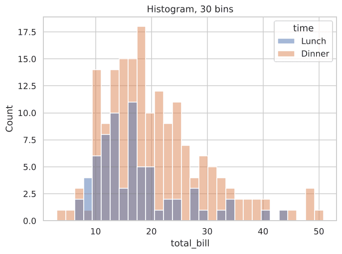
Figure 3.1: More bins provide finer detail across total bill amounts.
Comparing Distributions Across Groups
You can overlay distributions across categories using hue:
import seaborn as sns
import matplotlib.pyplot as plt

tips = sns.load_dataset('tips')
sns.histplot(data=tips, x='total_bill', hue='time')
plt.show()
2. Kernel Density Estimation (kdeplot)
What KDE Actually Means
Kernel Density Estimation (KDE) replaces rigid, discrete bins with a smooth probability density curve. It places a smooth kernel (usually a Gaussian bell curve) over every observation and sums them up into a single flowing line.
import seaborn as sns
import matplotlib.pyplot as plt

tips = sns.load_dataset('tips')
sns.kdeplot(data=tips, x='total_bill')
plt.show()
Layering KDE on Top of a Histogram
The most popular practice is combining both: the histogram shows raw observation counts while the KDE curve reveals the underlying distribution shape. Set kde=True in histplot:
import seaborn as sns
import matplotlib.pyplot as plt

tips = sns.load_dataset('tips')
sns.histplot(data=tips, x='total_bill', kde=True)
plt.show()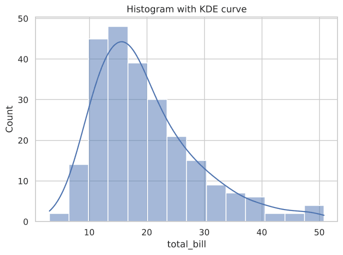
Figure 3.2: The smooth KDE curve overlaid directly on the histogram bins.
Comparing Two KDE Curves
import seaborn as sns
import matplotlib.pyplot as plt

tips = sns.load_dataset('tips')
sns.kdeplot(data=tips, x='total_bill', hue='time')
plt.show()
Interactive Data Distribution Check
Inspect distribution summary statistics programmatically:
Example
Output:
Try It Yourself
Problem 1: Custom Bin Histogram
Plot a histogram of tip from the tips dataset with 20 bins.
PygroundTry It Out
Plot a histogram of tip from the tips dataset with 20 bins.
Output:
Problem 2: Comparative KDE Curves
Plot a KDE curve of tip, split by sex.