Relational Plots: Scatter Plots & Line Plots
Relational plots let you explore how two or more numeric variables interact. Seaborn provides scatterplot() and lineplot() (as well as figure-level relplot()) with deep semantic encoding via colors, marker sizes, and grouping styles.
1. Scatter Plots: Spotting Relationships
A scatter plot places one variable along the x-axis and another along the y-axis, rendering a point for every observation in your dataset.
Basic Scatter Plot
Let’s see if restaurant diners who receive larger bills also leave larger tips:
import seaborn as sns
import matplotlib.pyplot as plt

tips = sns.load_dataset('tips')
sns.scatterplot(data=tips, x='total_bill', y='tip')
plt.show()
Adding Categories with hue
Pass hue='category_column' to color points based on qualitative dimensions—such as smoking vs. non-smoking tables:
import seaborn as sns
import matplotlib.pyplot as plt

tips = sns.load_dataset('tips')
sns.scatterplot(data=tips, x='total_bill', y='tip', hue='smoker')
plt.show()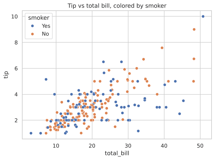
Figure 2.1: Each dot represents one meal, colored by whether the table was smoking.
Sizing Points by a Numeric Column
You can encode a third continuous variable using size:
import seaborn as sns
import matplotlib.pyplot as plt

tips = sns.load_dataset('tips')
sns.scatterplot(data=tips, x='total_bill', y='tip', size='size')
plt.show()
2. Line Plots: Trends Over Time & Confidence Bands
Line plots connect data points in order along the x-axis, making them ideal for time-series and continuous progressions.
Basic Line Plot
Using the classic flights dataset to examine air passenger counts:
import seaborn as sns
import matplotlib.pyplot as plt

flights = sns.load_dataset('flights')
sns.lineplot(data=flights, x='year', y='passengers')
plt.show()
Multiple Lines for Different Categories
Split lines across categories using hue:
import seaborn as sns
import matplotlib.pyplot as plt

flights = sns.load_dataset('flights')
sns.lineplot(data=flights, x='year', y='passengers', hue='month')
plt.show()
Understanding the Shaded Confidence Band
When multiple measurements exist for each x-value, Seaborn calculates the mean and draws a shaded confidence band (by default, 95% bootstrap confidence interval):
A wider band indicates higher uncertainty or variance between observations at that timepoint. A narrower band indicates that readings are tightly clustered around the mean.
import seaborn as sns
import matplotlib.pyplot as plt

fmri = sns.load_dataset('fmri')
sns.lineplot(data=fmri, x='timepoint', y='signal')
plt.show()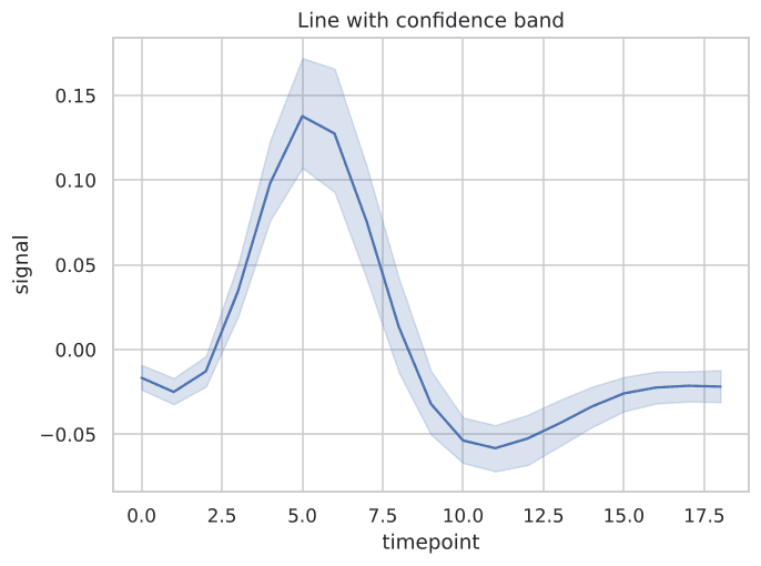
Figure 2.2: Line plot showing mean fMRI signal with shaded confidence interval band.
Interactive Demonstration
Explore dataset attributes and inspect observations directly:
Example
Output:
Try It Yourself
Problem 1: Scatter Plot with Time Encoding
Using the tips dataset, generate a scatter plot of total_bill vs tip, colored by time (Lunch vs Dinner).
PygroundTry It Out
Make a scatter plot of total_bill vs tip, colored by time.
Output:
Problem 2: Multi-line Flight Trends
Using the flights dataset, plot passengers over year with a separate line for each month.