Seaborn Capstones: End-to-End Real-World Pipelines
In practical data science, visualization is not an isolated task. Data starts as measurements or raw generated values, gets structured and cleaned in Pandas, and is finally translated into visual insights with Seaborn.
Capstone 1: The Full Exploratory Data Analysis (EDA) Workflow
Follow the exact 5-step methodology used by professional data analysts when exploring a new dataset for the first time:
Step 1: Broad Landscape Overview
Use a pair plot to visualize all numerical interactions simultaneously across categories.
Step 2: Distribution Inspection
Check the spread, skewness, and modality of your key target metric with an overlaid histogram and KDE curve.
Step 3: Correlation Matrix
Compute numerical correlations and render a diverging heatmap to highlight strong relationships.
Step 4: Regression Deep Dive
Fit a linear regression model with confidence intervals to model the strongest relationship discovered in Step 3.
Step 5: Categorical Variance & Polish
Analyze variance across qualitative groups using box plots, format titles and axis units, and export the figure.
Complete Workflow Implementation
import seaborn as sns
import matplotlib.pyplot as plt

sns.set_theme(style='whitegrid')
tips = sns.load_dataset('tips')

# 1. Broad overview
sns.pairplot(tips, hue='time')
plt.show()

# 2. Check key distribution
sns.histplot(data=tips, x='total_bill', kde=True)
plt.title('Distribution of Total Bill')
plt.show()

# 3. Correlation heatmap
correlation = tips.corr(numeric_only=True)
sns.heatmap(correlation, annot=True, cmap='coolwarm', center=0)
plt.title('Correlation Between Numeric Columns')
plt.show()

# 4. Regression deep dive
sns.regplot(data=tips, x='total_bill', y='tip')
plt.title('Tip Increases With Total Bill')
plt.xlabel('Total Bill ($)')
plt.ylabel('Tip ($)')
plt.show()

# 5. Categorical comparison and export
sns.boxplot(data=tips, x='day', y='total_bill', hue='smoker')
plt.title('Total Bill by Day and Smoking Status')
plt.savefig('final_summary.png', dpi=300, bbox_inches='tight')
plt.show()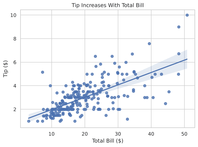
Figure 9.1: Step 4 of the exploratory workflow—fitting a regression trend line.
Capstone 2: The Real Pipeline: NumPy + Pandas + Seaborn
In production, data rarely arrives pre-packaged in a sample dataset. This capstone demonstrates the complete three-tier data stack:
- NumPy: Simulates continuous measurements and arrays.
- Pandas: Structures the data into a labeled DataFrame with derived categories.
- Seaborn: Uncovers visual answers and relationships.
Scenario: Gym Member Workout & Calorie Tracker
We track 40 members, measuring workout duration and calories burned.
Step 1: Generate Raw Data with NumPy
import numpy as np

np.random.seed(7)
member_id = np.arange(1, 41)
workout_minutes = np.random.normal(loc=150, scale=40, size=40).round().astype(int)
calories_burned = (workout_minutes * np.random.normal(loc=6.5, scale=1.2, size=40)).round().astype(int)
Step 2: Structure & Clean with Pandas
import pandas as pd

gym = pd.DataFrame({
    'member_id': member_id,
    'workout_minutes': workout_minutes,
    'calories_burned': calories_burned
})

gym['intensity'] = pd.cut(
    gym['workout_minutes'],
    bins=[0, 100, 180, 300],
    labels=['Light', 'Moderate', 'Heavy']
)
gym['cal_per_minute'] = (gym['calories_burned'] / gym['workout_minutes']).round(2)
Step 3: Visualize Insights with Seaborn
import seaborn as sns
import matplotlib.pyplot as plt

sns.set_theme(style='ticks')

# Regression of workout minutes vs calories burned
sns.regplot(data=gym, x='workout_minutes', y='calories_burned', color='teal')
plt.title('Workout Time vs Calories Burned')
plt.show()

# Calorie efficiency across intensity tiers
sns.violinplot(data=gym, x='intensity', y='cal_per_minute', hue='intensity', palette='muted', legend=False)
plt.title('Calories Burned per Minute, by Intensity')
plt.show()

# Distribution across members
sns.swarmplot(data=gym, x='intensity', y='calories_burned', hue='intensity', palette='dark', legend=False)
plt.title('Calories Burned, Spread Across Each Member')
plt.savefig('gym_capstone.png', dpi=300, bbox_inches='tight')
plt.show()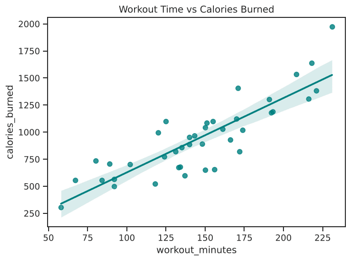
Figure 9.2: Regression analysis demonstrating strong correlation between exercise time and calorie burn.
Interactive End-to-End Simulation
Run the complete NumPy and Pandas data synthesis pipeline in your browser:
Example
Output:
Try It Yourself
Problem: Student Exam Performance Pipeline
Simulate 50 students’ study hours (mean=4, std=1.5) and exam scores (50 + study_hours * 8 + noise, capped at 100) using NumPy. Organize them into a Pandas DataFrame, categorize effort into ['Low', 'Medium', 'High'], and fit a regression line with Seaborn.
PygroundTry It Out
Build a synthetic student performance dataset and plot a regression line.
Output:
Wrapping Up
Congratulations! You’ve learned how to leverage Seaborn from foundational distribution and categorical analysis to complex matrix charts, custom multi-plot dashboards, and complete data pipelines with NumPy and Pandas.